Evidence Based Design - Environment of Care - Color
Design & Planning Considerations- Checklist
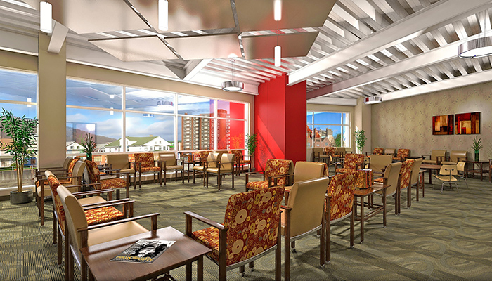
- Decorate with warm colors which are easier for older adults to see than cooler tones. Avoid bold patterns, especially on floors and walls, as the visual over-stimulation can exacerbate confusion in older adults.
- Avoid placing blue and green colors together as older adults have difficulty distinguishing these colors; also avoid pastels which are difficult for older adults to see.
- Use contrasting colors to highlight doors in patient areas; to reduce unwanted use, camouflage exit doors and out of bounds areas by using the same color on the doors as used on nearby walls.
- Differentiate walls from floors by using different, contrasting colors for each surface. (See Floors & Walls below)
- Handrails should be in a color that contrasts with the floor and the wall to help older adults with visual impairments to locate the handrails.
- Warm colors include combinations of red, orange, and yellow. Cool colors are made from blue, green, and purple combinations. Color is an added dimension which can evoke moods and make statements. Used effectively, color helps to highlight items in the environment for easy access or to hide items in the environment making them difficult to find.